Thursday, 20 December 2012

Question 5 - How Did You Attract/Address Your Audience?

How Did You Attract/Address Your Audience?


I felt that I was successful in attracting my target audience. When I showed my magazine to people that were at the age of 16 who liked to read pop magazines they knew straight away what the genre was and the response to my magazine was positive with hardly no critiscms. 
  The front cover I got positive feedback from and how the audience felt it looked "professional" and they also liked how I managed to get the brick wall to fade around the model creating a glow around her. They also liked the layout of the front cover and how everything is easy to see and read. I think that my front cover has matched the expectations of the target audience. They also agree that the font style used was really good and they liked how it was readable and the colour went well with the theme used of only keeping to three separate colours.


  The content's page as well got positive feedback and the audience agreed that it all worked well together. They liked the simple layout that I used and how everything was positioned so they could read it clearly. The font was also readable and stood out clear from the background. The layout they liked how everything was positioned but you could see where everything was on what page. They agreed that the pictures I used on my contents page was suitable for my target audience and that they worked well. Also the colours they liked because they were just simple and effective.

The double page spread also got a positive feedback and also the audience agreed again that it looked "professional" and how it still worked for the target audience. This was the favourite out of all the pages I had to design, they all agreed that the layout was good, not to over crowded and they liked the way that the writing was over one side, and there was a big picture over the other. The white background helped the magazine stay simple and not too much, and not distracting from what I wanted them to really read. Also they know by looking that this is a mainstream magazine by the conventions used.

Overall, I am happy with the responses I got from my target audience when I questioned them about how my magazine looks. From the overall positive thoughts I think that the magazine would be suitable for them and I think they were "preffered reading" since they gave me positive thoughts with no negatives.

Question 7 - Looking Back At Your Preliminary Task, What Do You Feel You Have Learnt In The Progression From It To The Full Product?

Looking Back At Your Preliminary Task, What Do You Feel You Have Learnt In The Progression From It To The Full Product?


Question 6 - What Have You Learnt About Technologies From The Process Of Constructing This Product?

What Have You Learnt About Technologies From The Process Of Constructing This Product?


Question 4 - Who Would Be The Target Audience For Your Media Product?

 Would Be The Target Audience For Your Media Product?

My magazine "Pop It" I think it targets people between the age of 15 - 18, and will be aimed more towards females. In my research for my target audience whilst planning my magazine I thought that it would be aimed at both females and males, but now I think it would be more for females.
  I think that the psycho graphics for the magazine are the same as my research, achievers, the people who want to achieve a lot in life and also radicals that like to stand out from everyone and also because it is a younger audience I also think they would still be hedonists,who like to play and enjoy life now. 
  My target audience will still be the same on the Jicnar scale of B-C and i think that the consumption profile has changed a little bit after the production. The new consumption profile is.


  • Look up to their role models. 
  • Go out with friends.
  • Going out and having fun.
  • Make their own fashion trends.
  • Go to the some of the music festivals.
My target audience has changed a little bit because I think they would be the type to look up to their favourite music artist and would like to be like them.


Question 3 - What Kind Of Media Institution Might Distribute Your Media Product And Why?

What Kind Of Media Institution Might Distribute Your Media Product And Why?


Question 2 - How Does Your Media Product Represent Particular Social Groups?

 How Does Your Media Product Represent Particular Social Groups?


Question 1 - In What Ways Does Your Media Product Use, Develop, Or Challenge Forms And Conventions Of Real Media Products?

In What Ways Does Your Media Product Use, Develop, Or Challenge Forms And Conventions Of Real Media Products?


Friday, 30 November 2012

Main Task: Production:Double Page Spread Finished

Double Page Spread Finished

This is my finished double page spread, I like how this has turned out and how it all looks. 


Main Task: Production: Content's Page Finished

My Finished Content's Page

This is my finished content's page, I am happy with how everything has worked and turned out.


Main Task: Production: Front Cover Finished

My Finished Front Cover

This is my finished front cover for my music magazine. I am happy how this is turned out and how it looks.


Monday, 5 November 2012

Main task: Planning: Locations & Health and Safety


Locations & Health and Safety
Front Cover:
For my location I am going to use as my background either a brick wall or a plain background, I want to use the brick wall because it can be used as a different sort of background or the plain wall because this will give off a more professional photo shoot.  I will get my models to come to wear I have decided to take the pictures and also use the props. I am going for the model to look like she has a slight attitude and also a nice side to her so she will go well with my target audience.


Double Page Spread:
For my double page I have decided on having the two models I picked on this, the background I want to have the models in a woody area, I have decided this because I want it to look different from other music magazines and hopefully this will attract my target audience to the magazine. 


Because these have been taken around my land I don't need permission for these pictures to be taken or for any of the pictures I use in my magazine.


Main task: Planning: Background, Font and Names

Background, Font and Names
Background: 
For my background on the front cover I have decided to either use a brick wall or a blank background. The blank background would let the model to stand out from the rest, the brick wall will give off a slight attitude and also a different sort of background compared to other magazines. 


Magazine Names: 
My name for my magazine I want it to appeal to my target audience and also something that would attract them if they saw it in a shop. I want it to also show that the magazine is based on music and the genre pop, so then the readers know straight away what the magazine is all about. 


Fonts: 
For the font I want it to stand out when you first pick up the magazine one of the things you notice is the title, because of the style of font I have used. 
http://www.fontspace.com/billy-argel/the-dreamer
http://www.fontspace.com/qbotype/zian

For the other pages of my magazine I want the text to still be the same but stand out less, the text will be simple so people can read it easy and don't have a hard time reading it
http://www.fontspace.com/roger-white/swansea
http://www.fontspace.com/david-rakowski/dubiel


Main Task - Costumes And Props

Front Cover
On the front cover I will use Beckie and make the picture look like a proffessional photo-shoot. I like the way Beckie was dressed for when I was deciding which model to use, I think her quirky fashion should be kept on the proper front cover. I have decided that Beckie will wear slightly formal outfit that shows off her style, she will wear black high waisted shorts or I might use leggings, a button up top, a blazer and to make the whole outfit look a little bit casual a pair of black pumps. I have decided to base it on one of my favourite aritsts front cover, Cher Lloyd. I will be using a prop on the front cover of my magazine the prop will be Beckie holding a camera. 


Double Page Spread
For my double page spread I will use Beckie and this time add Chloe into the magazine. This time they will be stood in the middle of a group of trees, the trees will be used as props for the picture. For what they will be wearing will be related to my target audience, I want my target audience to see what their wearing and go out and buy some of the items. The clothing idea is basically what my target audience will buy if they saw it in their favourite shop. I have decided to keep what Beckie is wearing the same, Chloe I am going to create what she wears. 

For what Chloe wears I am going to use some of her fashion sense in this photo. I hve decided that she will wear an oversized jumper, a shirt underneath and leggings, all of this will be completed with a pair of converses. I have decided to use two different looks to show what two different individuals fashion sense. This will go well with my target audience because some of them may choose this casual look and then make it more interesting by adding a twist


 I created a plan of the costumes and props in Microsoft word, this show what the costume/prop is, where the source is from, the potential cost and the person in charge.


Main Task - Planning - Performers And Casting

For my front cover of my magazine I want to create a proffessional photoshoot feel of a typical popular music magazine. I casted two models for the role of the artist. I have casted Beckie Price and Chloe Stokes as my models. I have chosen these two because I think they will be suitable for my target audience, they are the type people would use as a role model and look up to them. 


The model above Beckie Price I have decided to use because she shows her individual style that people would use for inspiration. I think she also fits in with the genre conventions in the audience profile. Her fashion sense shows that she is a radical and that she likes to stand out with what she wears, I think she gives off the look and would be suitable for my target audience and magazine. 


We these two models I have decided to only use one in my magazine. To decide on which model I will use I looked at: 
  • Which one my target audience will look up to. 
  • Which one my target audience would use for inspiration in what they wear.
  • Which one my target audience would like to know if they could.
Taking all this into account I have decided to use Beckie as my model for my front cover of my magazine. Chloe I may use on my double page spread because I think she would fit well. I will arrange a meeting with the models to discuss what they need to wear for and what props to bring for when I need the proper pictures.


Main Task - Time Management

For my time management I have created a schedule on my phone which I will keep looking at during the week. I am using blogger on my phone to put my schedule and times on here:

Monday 29th October: 
  • Pictures I have taken of Beckie and Chloe around my land. Also include how they relate to my target audience and the genre for my magazine. Sort out what props I am using and also what they will wear in the proper pictures.
Tuesday 30th October: 
  • Using the magazine front cover, contents page and double page spread I analysed and also to get other people's opinions I will make a facebook group and ask other people what they think.
Thursday 1st November: 
  • Rough drawings of my plan for my magazine.
  • Find what would be suitable colours and fonts.
Production:
  • Start getting pictures together for my pages of my magazine. 
  • Information of what I should put in them.
  • Create a front cover on photoshop.
  • Create a contents page on InDesign.
  • Create a double page spread

Main Task: Research: Analysis of Magazine Double Page


Main Task: Research: Analysis of Magazine Contents Page


Main Task: Research: Analysis of Magazine Covers


Saturday, 3 November 2012

Main Task - Audience Profile


Audience Profile

Friday, 28 September 2012

Connotations..!

Connotations..!

Some connotations I would use to communicate:  
  • Hard Working
  •  Fun
  • Creative
  • Academic
  • Ambitious 

To communicate these connotations I would for "Hard Working" use a range of images of students working, for "Fun" I would use pictures of students enjoying themselves out with friends and also having fun at sixth form, also I would use a couple of colours to show "Fun". For "Creative" I would write a bit about what the students do and have some pictures of their creative work. To show "Academic" I would use images of students working hard on their studies and a little bit of writing underneath. To show "Ambitious" I would ask a student what they want to do, take a picture of the student then underneath put what they said they wanted to do.

Thursday, 27 September 2012

Audience Profile..!

Audience Profile..!

The people who would read my magazine would be: 
  • Like to hang out and socialise with their friends. 
  • Like going out with friends and partying.
  • Enjoy life and have a good time.
  • Keep up to date with everything.
  • Look forward to the future. 
  • Students that want advice on things.
  • Want to have fun.
  • Like to look on the bright side of everything.
  • Want to achieve the best they can.


The Psychographic of my target audience would be Achievers and Succeeder's because producing a student magazine and the students have achieved something to get into sixth form. They would be Achievers because they want to achieve and get somewhere in life and hopefully have a good future in front of them. The Social Values would be Hedonists because it means "to play, or enjoy life now!" and you should enjoy life while you're young but also work as well to get where you want to get to and have a bright future.


Wednesday, 26 September 2012

Semiotics And Analysis Of Three Magazines..!

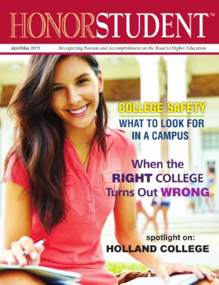
Publication preview The sign of this magazine would be the pen. The denotation of this would be the model smiling with a book rested on her knee holding a pen. The connotation of this could be smart, well educated, enjoying college. The pen could show that she is taking her studies seriously and is working hard to achieve her goals. The connotations could be anchored down to that she is well educated because you have to do well to get into higher education. The icon for this would be the model, the index would be her smile to get across that being a student is fun, and the symbol would be "student" because that is what she is.


TIME Magazine Cover: Student Athletes and Education -- Apr. 3, 1989

The sign of this magazine would be the basketball net. The denotation of this would be the the basketball player holding the ball, standing inside net, with paper inside and a piece outside the net. The connotation of this would be game, winning, losing, sport, trapped, stuck. The net could show how then player is trapped inside and can't get out, the paper all around could show how his education doesn't mean that much to him. The connotations could be anchored by the quote saying "athletes can earn millions for schools, but are they getting an education?" This is how the picture has been anchored down. The icon for this would be the basketball net, the index would be him holding the ball showing how basketball is more important to him then education, and the symbol would be "the college trap" showing what they believe is happening to basketball players education.


The sign of this magazine would be the man. The denotation would be the man crouching in a field, wearing a checked shirt, wearing glasses and has loads of tattoo's on his body. The connotation of this would be skater, moving in the world, rising star.  The glasses he is wearing could show that he is smart and has managed to rise to fame on his own, also the glasses could show that he is stylish since those type of glasses have come into style. The icon for this magazine cover would be the man, "Dallas Green," the index would be the tattoo's which shows that he quite alternative, and the symbol would be his name because he is the name that people will hear as he rises to fame and becomes more popular. 


Tuesday, 25 September 2012

Hello, My name is Lauren Bayliss and this is my AS Media Coursework Blog!

I am interested in getting a job in the media industry and I would like to work for a fashion magazine as a photographer. 

I listen to a range of music mostly music that is played on radio 1.  <3